
Scatter Plot
A scatter plot, or scatter chart, is a mathematical diagram showing the relationship between two variables. The data points are represented by xy coordinates that look like individual “scattered” dots.
Key Takeaways
One of the 7 tools of quality in quality management
Used to identify cause and effect relationships
Continuous data is better than discrete data
What Is A Scatter Plot?
A scatter plot is a chart that maps a data set that includes two variables. Scatter plots are best used for continuous data rather than discrete data. Continuous data occurs along a range of values, whereas discrete data has stop gaps.
Most often, continuous data shows values over time, where discrete data is just about a singular event.
Oftentimes, the numbers along the horizontal x-axis are independent variables, and the numbers along the vertical y-axis are dependent variables.
5 Types of Correlation
Correlation is an assessment of the relationship between plotted points of a scatter chart.
The most basic way to do this is to see if you can draw a straight line running through the majority of the plotted points with equal numbers of points above and below the line. This is commonly referred to as a “line of best fit”. The closer the plotted points rest to the line indicates a stronger correlation.
There are dozens of correlation types in the field of mathematical regression and statistics, but here are the 5 basic types that you can use in assessing quality control for manufacturing.
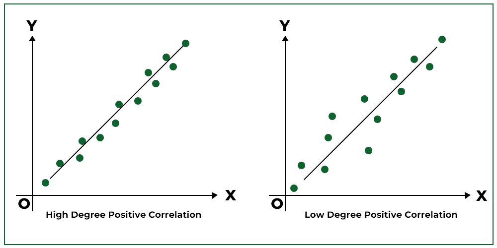
1. Positive Correlation
Scatter charts with a positive correlation have a diagonal line of best fit that rises as the x-axis increases from left to right.
Again, take note of the strength of the correlation in the following image, based on how closely the plotted points sit relative to the straight line.
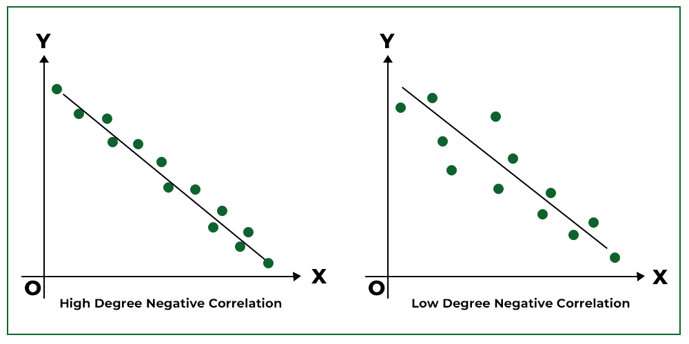
2. Negative Correlation
Scatter plots with negative correlation have a diagonal line of best fit that falls as the x-axis increases from left to right.
Note that “negative” correlation isn’t a “bad” conclusion – it is simply the word used to describe the line of best fit pointing downwards when read from left to right.
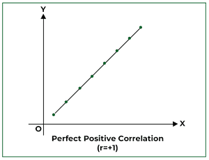
3. Strong Correlation
The strongest correlation possible is called “Perfect Correlation”, and is when all the data points plotted rest exactly along the straight line.
The diagram below shows a positive, perfect correlation.
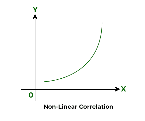
4. Non-linear Correlation
Okay, there ARE some instances where lines of best fit are not straight – but you can’t just draw a squiggly line wherever you want. Without getting too deep into quadratic equations and calculus (you can use MES software for that), let’s explain what it means.
A non-linear correlation is a curve which changes in slope as the value of a single variable changes.
For example, it may be that adding one pound of extra material into a production process does lead to an increase in the final product weight, but the final product does not increase pound for pound of material added. That is, it is not a linear correlation, but there still is a relationship between the two variables (weight of extra material added, and weight of final product).
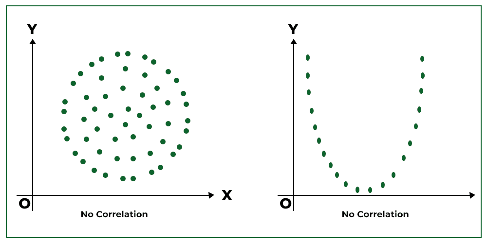
5. Weak to No Correlation
Weak correlation, or the absence of correlation, occurs when there is no possible straight line or functional curve that can be drawn through the diagram of data points on a scatter plot.
What this means in real life is that there is no inherent pattern between two variables – in other words, both variables are independent of each other.
How Is A Scatter Plot Useful?
Scatter plots are especially useful when you have a data set with two variables.
If you have a scenario where there are many points of data on a scatter plot where it is difficult to see the individual points, a version of a scatter plot that helps would be a heatmap.
A heatmap is a form of a scatter chart that more clearly shows the density of plotted points. In a way, density is another form of a line of best fit because you can see at a glance where the strongest correlation rests.
You may often hear that scatter plots help determine cause-and-effect relationships, but that’s not exactly true – scatter plots can only identify correlation, not direct causation.
However, determining strong correlations between variables aids in your root cause analysis and can help with identifying causes and effects.
Scatter Plots Uses Within Manufacturing
Scatter plots are widely used in many industries, but hold a special place as one of the 7 basic tools of quality in manufacturing. Here are some of the most useful applications:
- To see whether a process is “in control”
- Predictive forecasting within data trends
- Linear regression models showing degradation of machinery over time
- Cost and budget estimations
- As part of root cause analysis